Classlete | UI/UX Case Study
Sports cards and posters for student athletes in North America.
"As an early-stage start-up, being able to entrust someone with our customer journey and experience is a big deal and Laxsan has been stellar throughout our working relationship."

- Chris | CEO, Classlete

Introduction
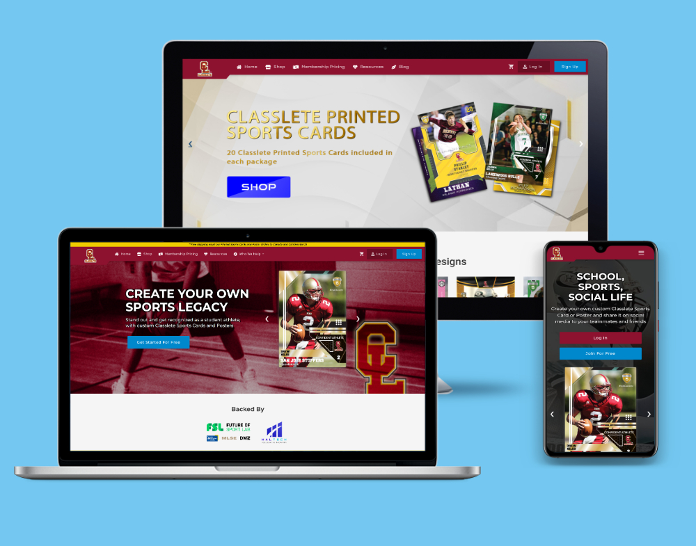
Classlete is a platform for student athletes, where they can create their own personalized sports cards and posters.
Very few student athletes go on to have professional careers playing sports. That means that the majority of these young athletes will never get the opportunity to feel like a true pro.
Classlete gives these athletes the opportunity to show off their accomplishments and feel like their favourite professional athletes!
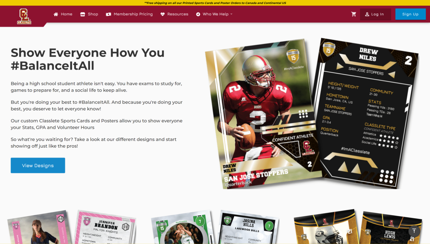
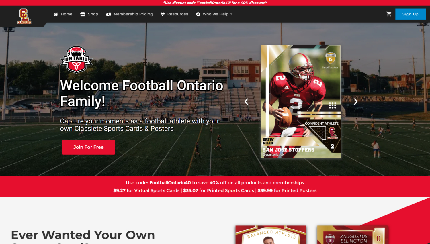
Turning website visitors into paying customers
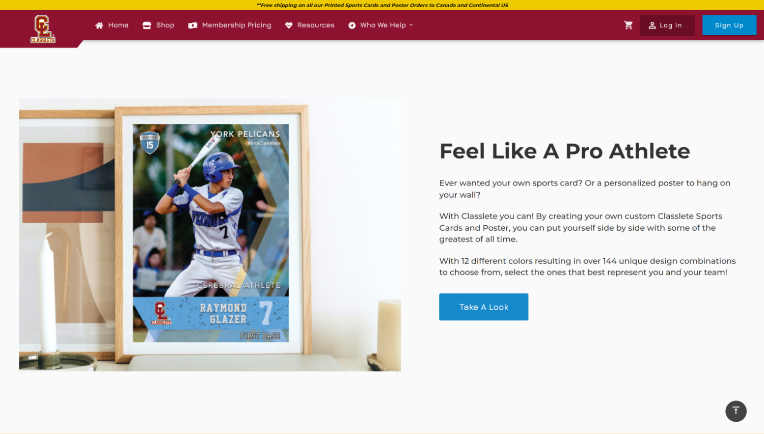
Redesigning and developing the website to improve conversions was the main goal.
The majority of the visitors were student athletes, so the biggest challenge was designing pages that are simple enough for young athletes, but also visually engaging to keep them interested.
"He was always willing to lend a helping hand, share his knowledge, and collaborate with other members of the team to achieve project goals. He also showed a great deal of initiative, taking ownership of his work and constantly looking for ways to improve the user experience."

- Dom | CTO, Classlete

Understanding user pain points
I conduced usability tests with ideal customers, by letting them walkthrough the entire profile creation process. As they were going through the process, I was able to take notes on how we can improve the UX. There were parts where users stalled for a second, or had trouble figuring out how to move on to the next step. I brought those findings back to the team, and started working on improvements.
User Flow (New Signup)

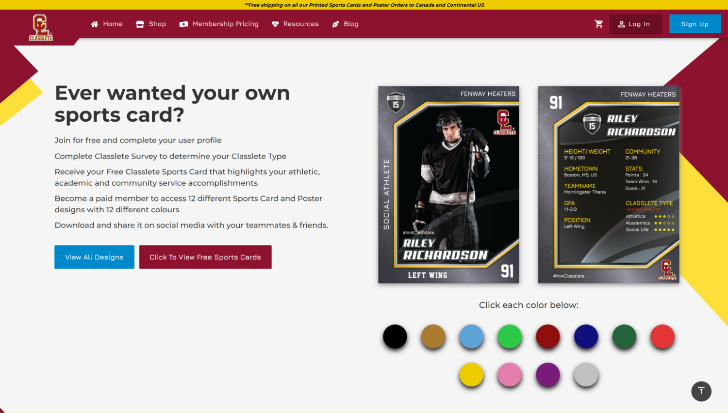
Designing a simple and visually engaging platform
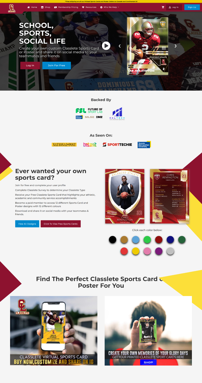
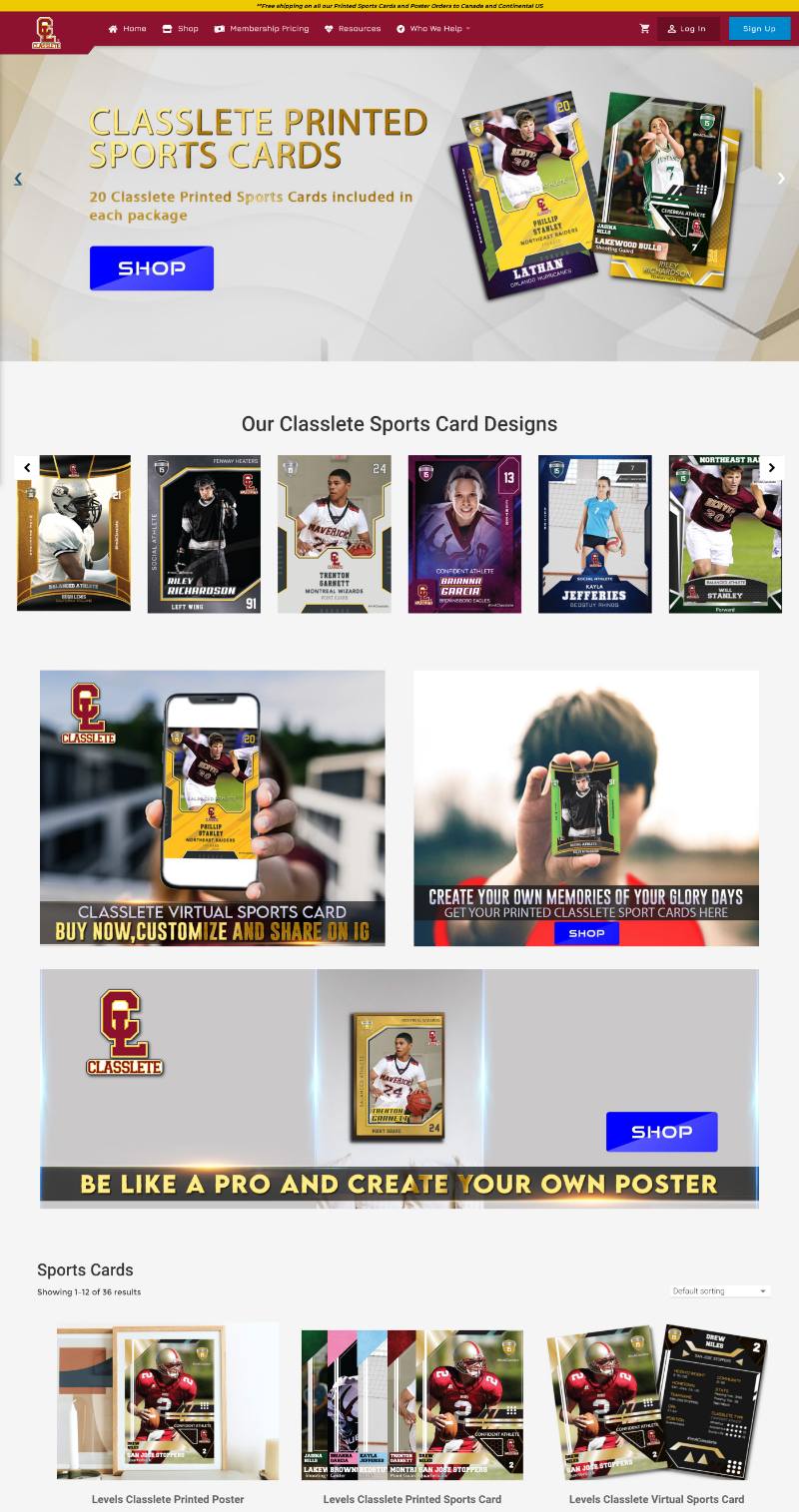
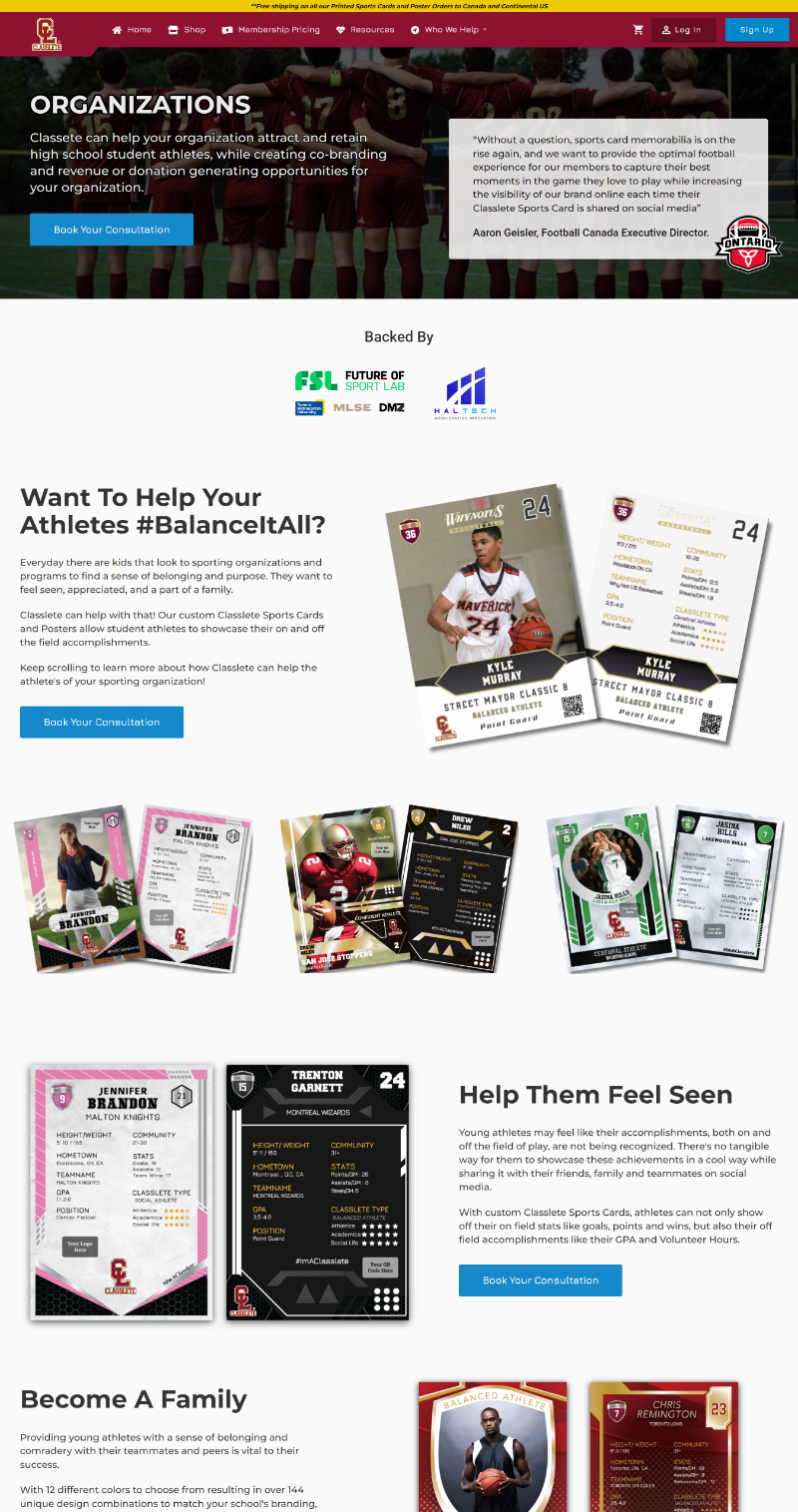
Given that the target audience are student athletes, I knew that this website needed to have the right balance between simple and engaging.
With that in mind, it was clear that a simple layout, clear copy, and lots of images and colors was the key to designing an effective interface for student athletes.
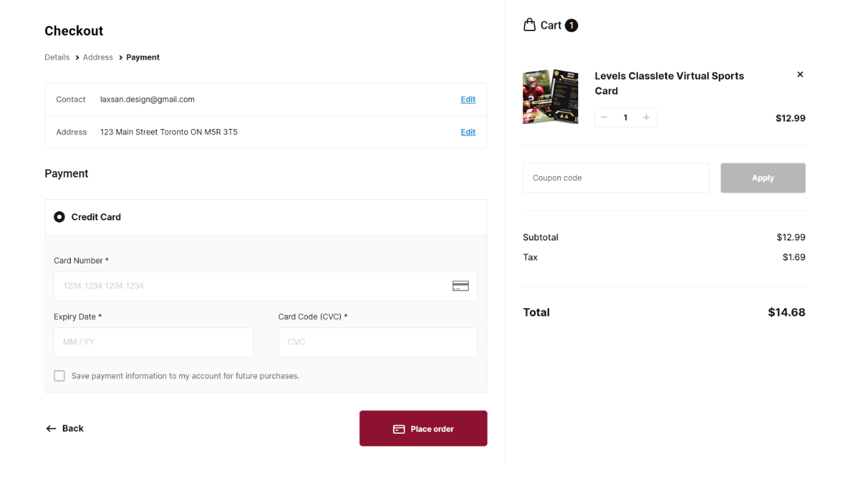
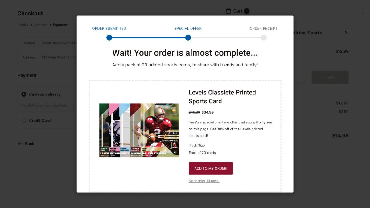
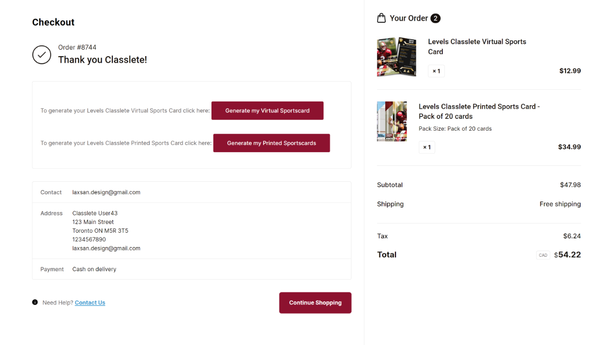
Completing a purchase
Even after optimizing all the pages of the website, the work wasn't done. Because of the complexity of the products (Digital Cards vs Printed Cards, pack size variations, different colors, etc.), the checkout experience had to be optimized as well.
Final Results
The redesign of the Classlete platform resulted in a significant improvement in user engagement, conversions, and mobile responsiveness. The platform now provides student athletes with a way to showcase their accomplishments and feel like professional athletes, and we continue to receive positive feedback from our users.
"I was able to trust him with the whole UX of my website. He took ownership of the work, and treated it like it was his own website. He always has new ideas that are supported with analytics data and research. Working with Laxsan was a wonderful experience!"

- Harman | Founder, Webplate

Bring peace of mind to your business
Finding the best ways to convert website visitors into paid customers shouldn't be a guessing game.
Get In Touch