NuvoHouse | UI/UX Case Study
E-commerce store selling clean supplements.
"As an early-stage start-up, being able to entrust someone with our customer journey and experience is a big deal and Laxsan has been stellar throughout our working relationship."

- Chris | CEO, Classlete

Introduction
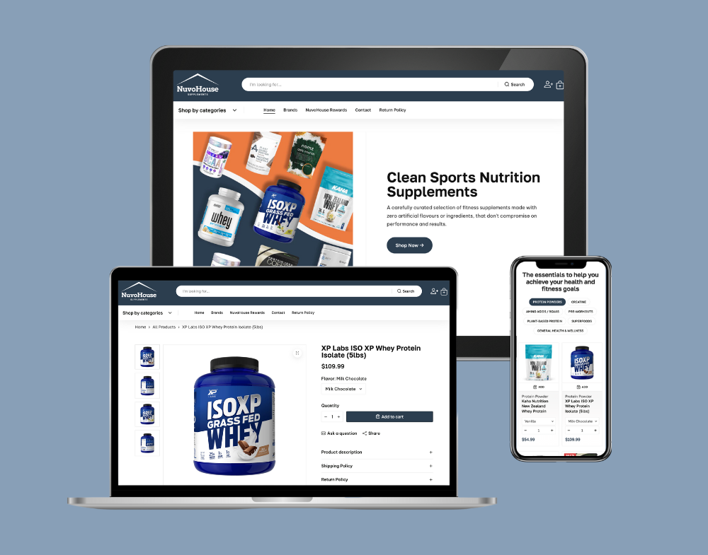
NuvoHouse is an online supplement store that only carries clean health and fitness supplements.
There are plenty of supplements on the market, but finding ones with no artificial flavours or ingredients is hard to find. By only carrying these types of supplements, NuvoHouse makes it easier to find them.
Understanding the pain points of ideal customers
Before designing a user interface, it is important to understand where the target audience struggles the most. By having an understanding of their pain points first, we can design the interface in a way that eases their stress and alleviate any concerns they may have.
The more effective we are at addressing these areas, the more likely we are to get our ideal customers to convert into paying customers.
In the case of NuvoHouse, the ideal customers had 3 main pain points:
- 1. Confused by too many supplement options with unclear ingredient labels
- 2. Concerned about artificial additives and side effects
- 3. Limited time to shop for and research supplements
Building trust with website visitors
Based on the 3 biggest pain points our ideal customers had, it was clear that building trust with them would go a long way. Here are some different ways we built that trust on the website:
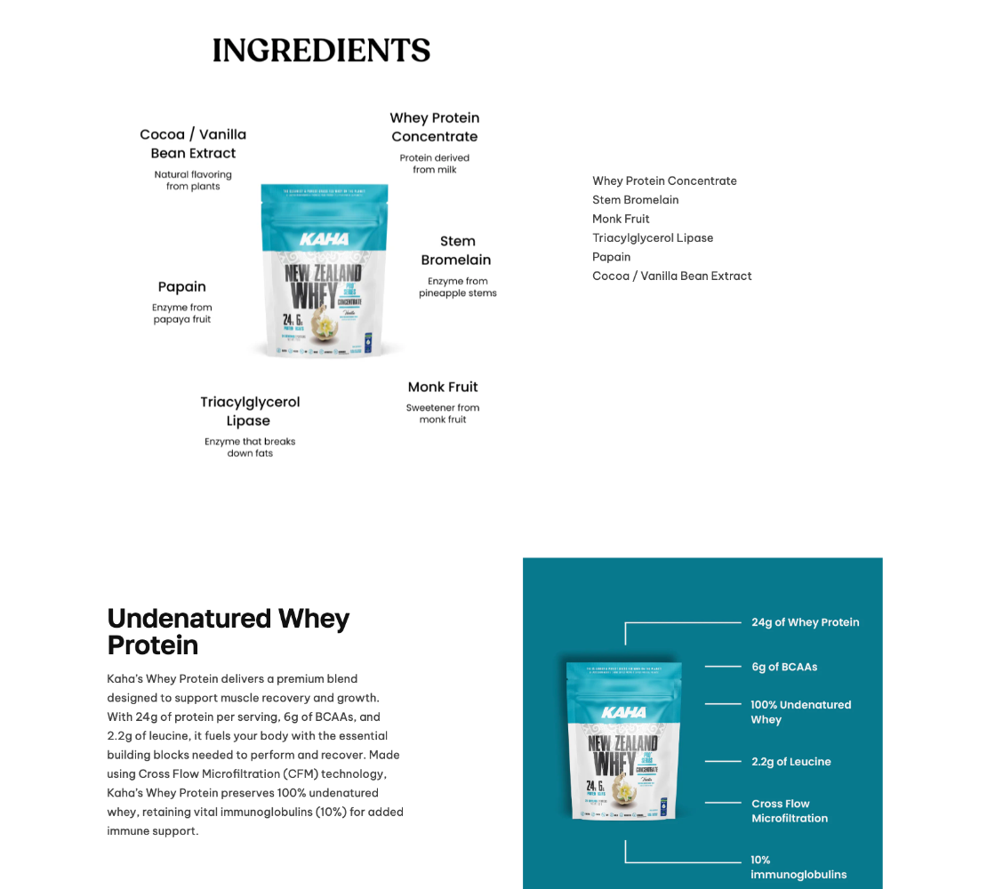
- 1. Included a graphic on all product pages that clearly listed all ingredients
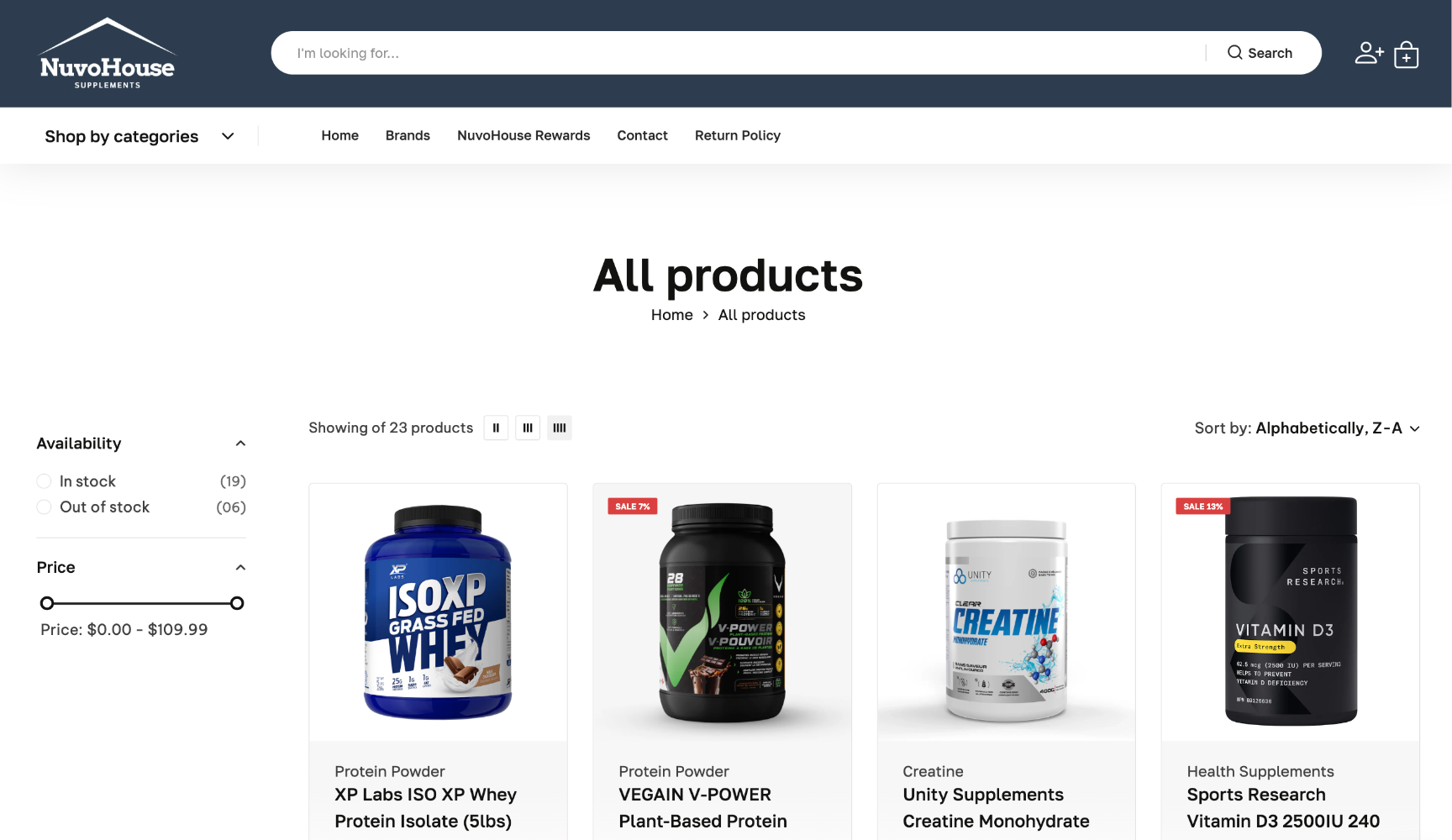
- 2. Clearly displayed return policy links, adding it to prominent places like the main navigation
- 3. Used copywriting tone of voice that sounded like website visitors were talking to a peer, not AI
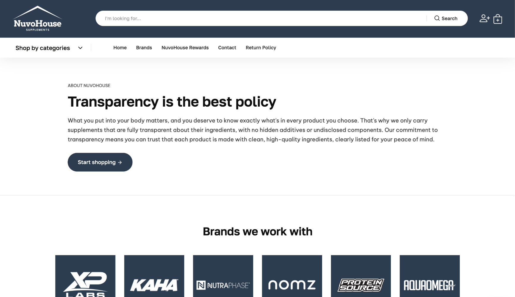
- 4. Took every opportunity to emphasize the fact that you will only find clean products on the website - products with no artificial flavours or additives
- 5. Gathered and displayed reviews and testimonials
- 6. Added logos of the different brands of products that are carried in the store
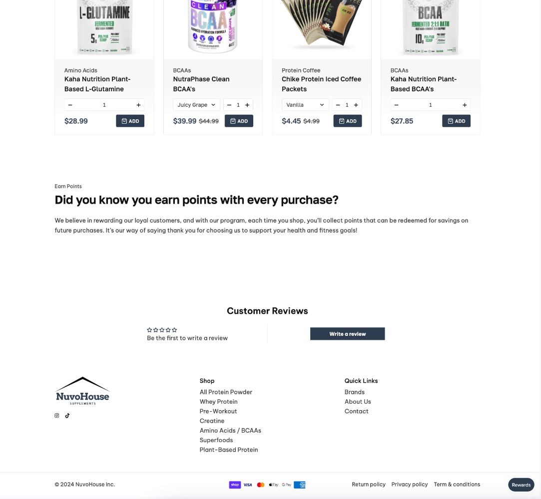
No time to waste
One of the pain points our ideal customer had was that they didn't have the time to sit there and research which supplements were best for them. They needed the right info in a small amount of time.
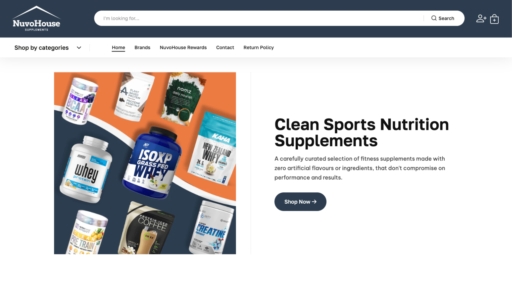
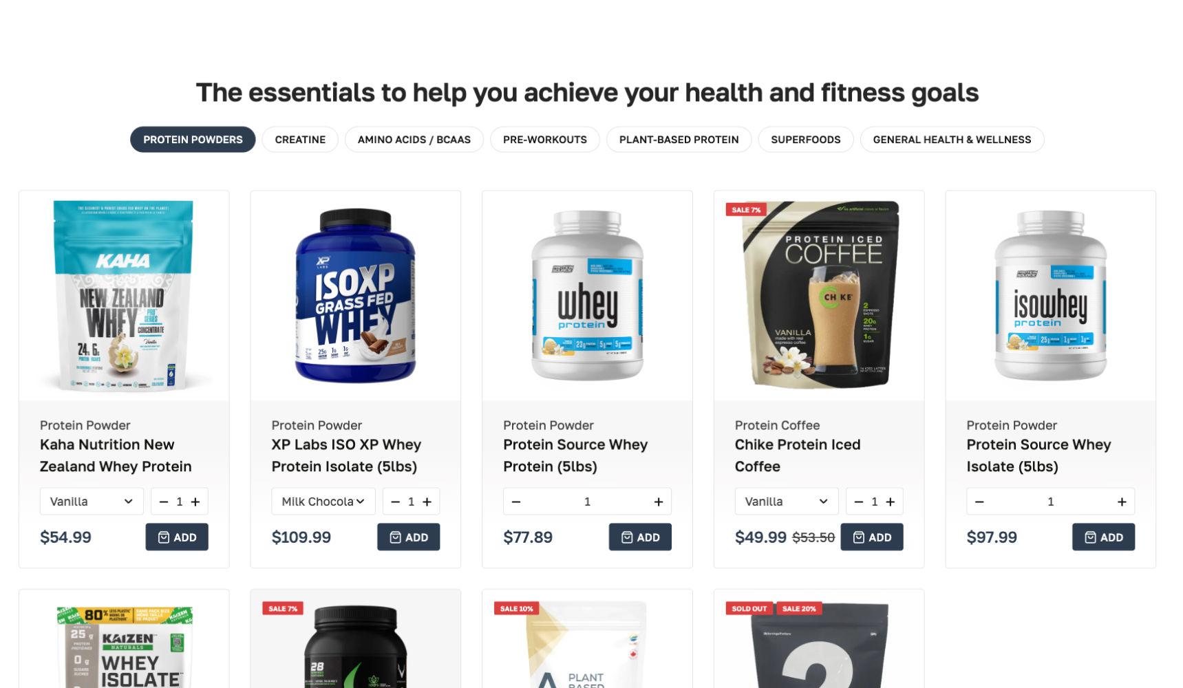
With that in mind, I designed an interface that was product focused with little distractions, and made it easy for visitors to find what they are looking for. Here are some ways I accomplished this:
- 1. Pominent search bar at the top of every page (above main navigation)
- 2. Product collection tabs on home page, towards the top of the page
Final Results
After developing and launching the website, and recording analytics data for 3 months, we say above average engagement times, engagement rates, and overall conversion rates.
After 3 months, the website say an overall engagement time of 1m 6s, engagement rate of 74%, and a coversion rate of 3%.
"I was able to trust him with the whole UX of my website. He took ownership of the work, and treated it like it was his own website. He always has new ideas that are supported with analytics data and research. Working with Laxsan was a wonderful experience!"

- Harman | Founder, Webplate

Bring peace of mind to your business
Finding the best ways to convert website visitors into paid customers shouldn't be a guessing game.
Get In Touch