Webplate | UI/UX Case Study
Website template store providing HTML5 and Figma files.
Introduction
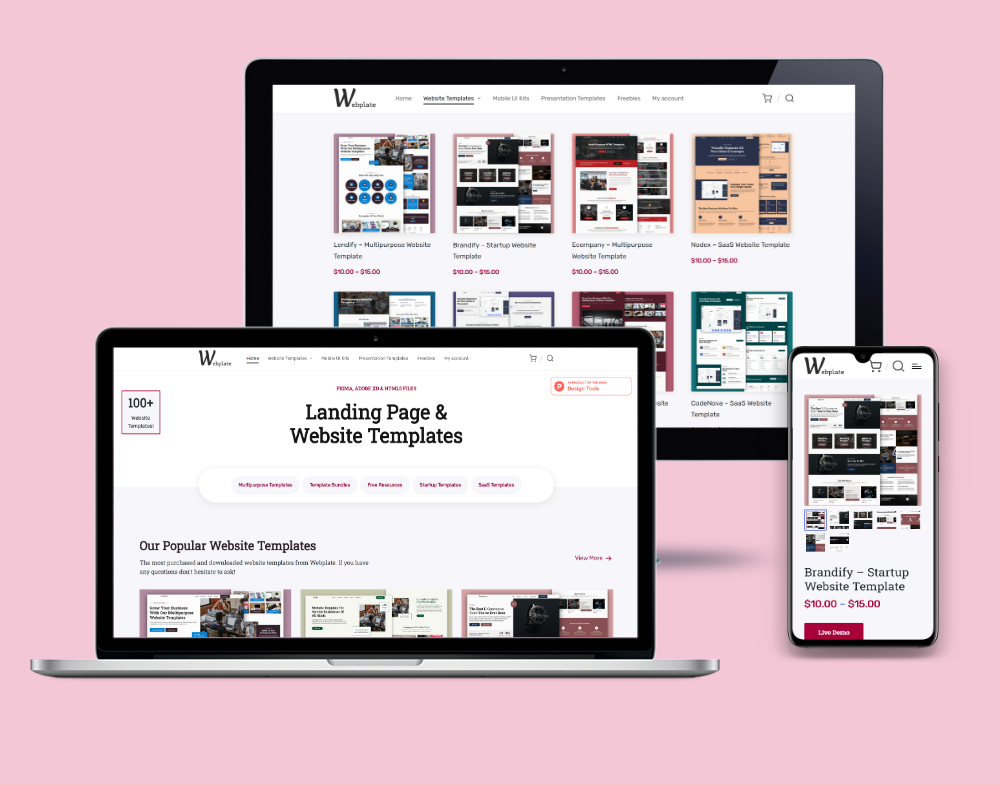
Webplate is a website template store, where other designers and agencies can purchase templates to complete client projects in a shorter amount of time.
As the lead designer for Webplate, one of the main challenges I faced was to improve the user experience of the purchasing experience for customers. With the goal of increasing conversions and reducing website bounce rates, I initiated a redesign of the entire platform.
"I was able to trust him with the whole UX of my website. He took ownership of the work, and treated it like it was his own website. He always has new ideas that are supported with analytics data and research. Working with Laxsan was a wonderful experience!"

- Harman | Founder, Webplate

User Research
I started by conducting user research to better understand the pain points users were experiencing.
The quickest and most effective way to conduct user reasearch for this platform, was to study how people were reviewing/talking about similar platforms that are more popular and have been around for longer.
I went to popular review sites, read testimonials and comments on social media content, and had email conversations with customers of these similar and popular platforms.
One of the biggest things I learned, was that users wanted to find templates for their specific needs as soon as possible. Instead of having to browse through thousands of templates, they wanted to be able to filter their searches, as soon as they land on the website.
A simple solution to that, is to have a search bar where users can search for exactly what they're looking for. But another thing I learned during this research process, is that sometimes users don't know exctly what they want. They may have a rough idea, but they don't always know what to search for.
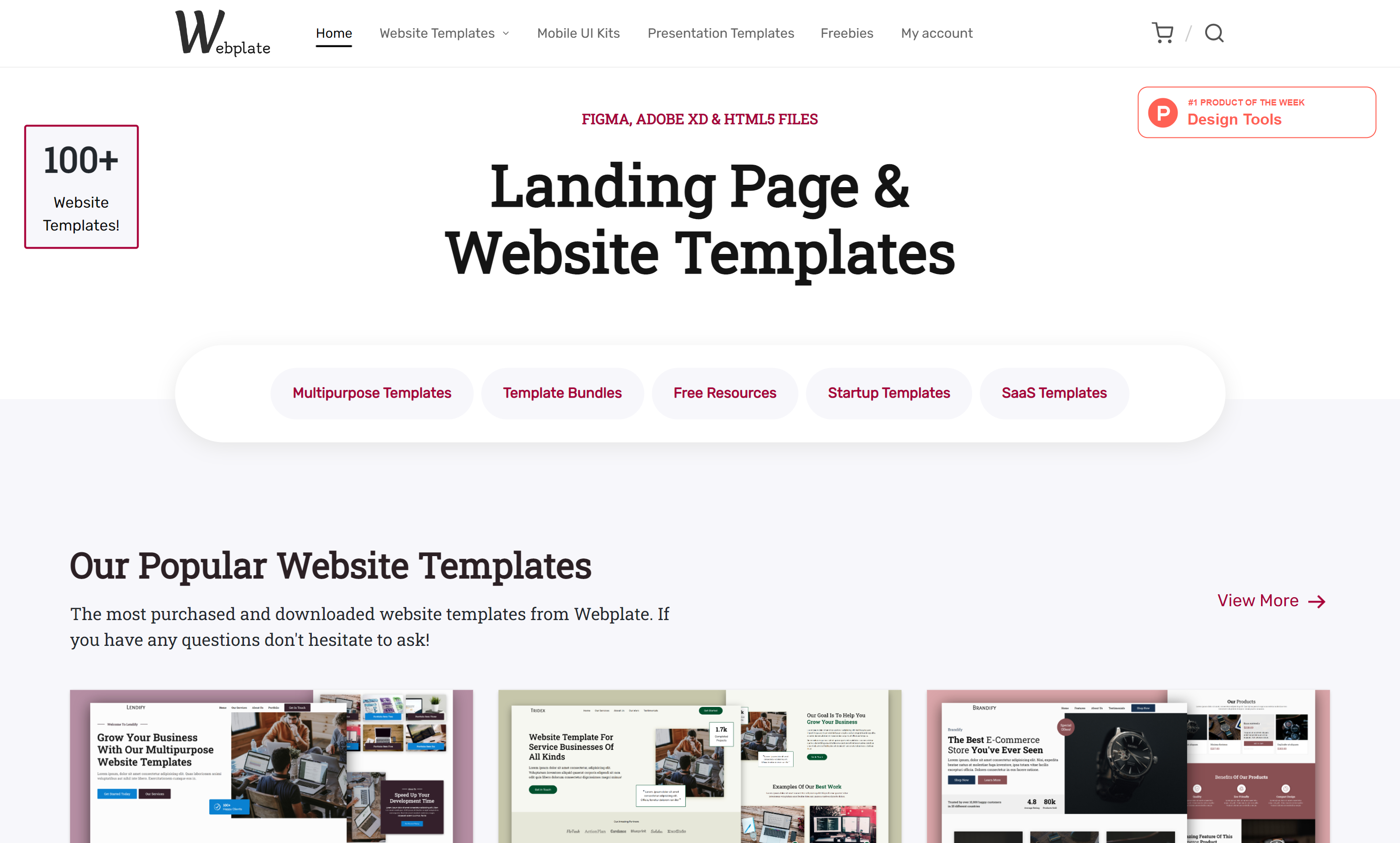
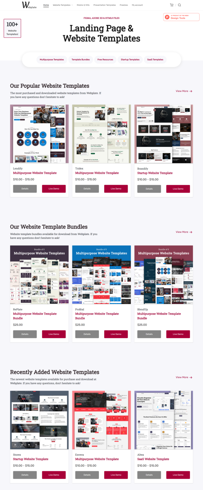
So the solution was to have tabs right under the main heading, that links to popular categories of website templates. This way, users that don't know exactly what they're looking for. can still narrow their searches down.
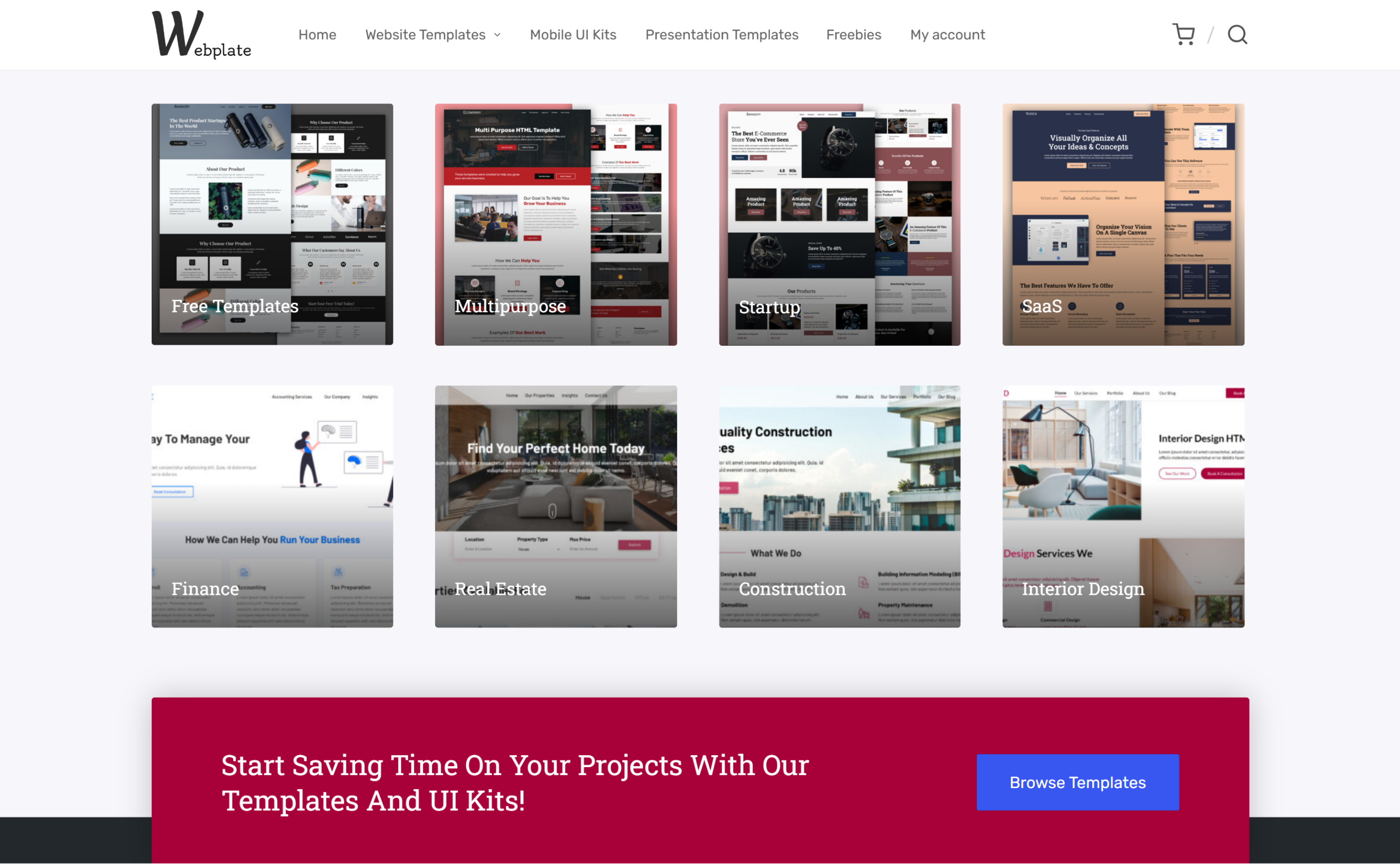
I also learned there are users who know they want a template, but have no idea what to look for. They don't know what category would be best for their needs.
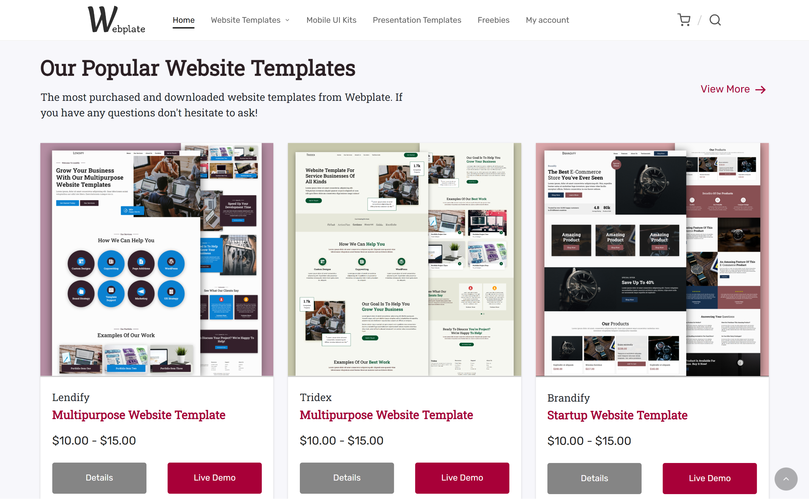
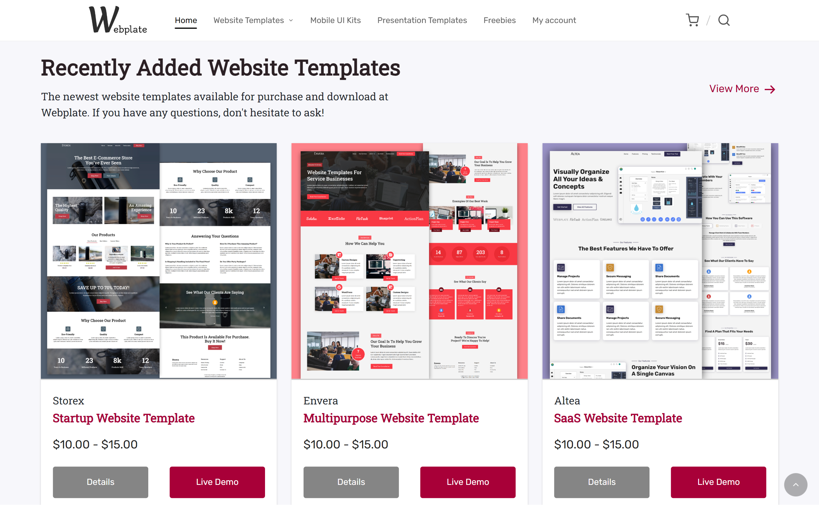
That's why, just below the hero section, I added blocks that contain some of the most popular templates that other users have been purchasing. This way users who don't know what to search for or how to find what they want, can see what people similar to them find interesting and worth their time and money.
User Persona

User Flow

Final Website Product
Conclusion
By prioritizing user research and implementing a user-centered design, I was able to improve the user experience of the Webplate platform. This resulted in a significant increase in conversions and a decrease in website bounce rates. I will continue to monitor user feedback and make improvements to the user experience as needed.
"As an early-stage start-up, being able to entrust someone with our customer journey and experience is a big deal and Laxsan has been stellar throughout our working relationship."

- Chris | CEO, Classlete

Bring peace of mind to your business
Finding the best ways to convert website visitors into paid customers shouldn't be a guessing game.
Get In Touch